모달 컴포넌트 UI/UX 설계 가이드
모달(Modal)은 사용자와의 상호작용을 잠시 중단시키고 중요한 정보 또는 결정을 요구하는 UI 요소입니다. 단순히 "레이어 팝업"이 아닌, 사용자 경험과 접근성 측면에서 아주 민감한 컴포넌트입니다.
이 문서에서는 모달을 설계할 때 고려해야 할 UI/UX 요소, 디자인 원칙, 접근성 지침(A11y), 그리고 실제 설계에 도움이 되는 수치적 기준까지 다룹니다.
💡 참고: 본 문서에 사용된 수치는 대부분 Material Design 및 Apple HIG에서 정의한
dp(density-independent pixel) 또는pt(point)를 웹 상에서 일반적으로 사용하는px기준으로 환산한 값입니다. 논리 해상도 기준에서1dp ≈ 1px로 간주하고 작성하였습니다.
✅ 모달이란?
사용자와의 상호작용 흐름을 일시적으로 차단하고 중요한 정보나 동작을 요구하는 UI 컴포넌트입니다. UX 상 매우 강한 개입(interruption)을 동반합니다.
✅ 모달의 UX적 역할
| 역할 | 예시 |
|---|---|
| 안내 | 시스템 메시지, 알림 등 |
| 결정 유도 | 확인 / 취소 |
| 입력 | 로그인, 회원가입, 검색 필터 등 |
| 흐름 분기 | 예약 상세 보기, 이미지 미리보기 등 |
잘 만든 모달은 사용자의 흐름을 안전하게 일시정지시켜야 합니다.
나쁜 모달은 이탈을 유도하거나 피로도를 높입니다.
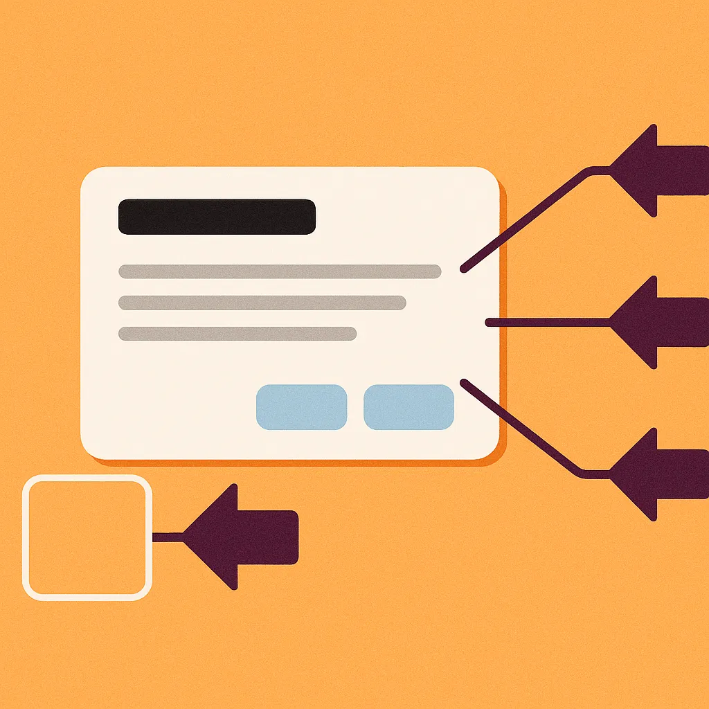
✅ 모달의 구성 요소 분석
| 요소 | 설명 |
|---|---|
| Dimmed 영역 | 배경을 어둡게 하여 포커스를 집중시킴 |
| Content Box | 실제 내용을 표시하는 중심 레이어 |
| Close 방식 | ESC, X 버튼, 배경 클릭 등 |
| Focus Trap | 키보드 탐색이 모달 내에서만 가능해야 함 |
| 스크롤 방지 | 배경 스크롤 금지 (body { overflow: hidden }) |
| 애니메이션 | 열리고 닫힐 때 부드러운 전환 |
| 접근성 | ARIA 속성, 포커스 제어, 배경 비활성화 등 포함 |
📐 모달을 어떻게 설계할 것인가?
1. Portal 구조 도입
모달은 DOM의 하위 구조에 묻히면 z-index, overflow, focus 제어가 어렵습니다.
→ React Portal을 활용해 #modal-root 등 최상위 DOM 노드에 렌더링하는 것이 필수입니다.
import { createPortal } from "react-dom";
export default function Modal({ isOpen, onClose, children }) {
if (!isOpen) return null;
return createPortal(
<div className="modal-overlay" onClick={onClose}>
<div className="modal-content" onClick={(e) => e.stopPropagation()}>
{children}
</div>
</div>,
document.getElementById("modal-root"),
);
}2. 포커스 트랩 (Focus Trap)
키보드 사용자를 위해 Tab 키 탐색이 모달 내부에서만 순환해야 합니다. 이를 위해 focus-trap-react 같은 라이브러리나 직접 구현이 필요합니다.
import { useEffect } from "react";
export default function useFocusTrap(
containerRef: React.RefObject<HTMLElement>,
isActive: boolean,
) {
useEffect(() => {
if (!isActive || !containerRef.current) return;
const container = containerRef.current;
const selectors = [
"a[href]",
"area[href]",
"input:not([disabled])",
"select:not([disabled])",
"textarea:not([disabled])",
"button:not([disabled])",
"iframe",
"object",
"embed",
'[tabindex]:not([tabindex="-1"])',
"[contenteditable]",
];
const getFocusable = () =>
Array.from(
container.querySelectorAll<HTMLElement>(selectors.join(",")),
).filter(
(el) => !el.hasAttribute("disabled") && !el.getAttribute("aria-hidden"),
);
const handleKeyDown = (e: KeyboardEvent) => {
if (e.key !== "Tab") return;
const elements = getFocusable();
if (!elements.length) return;
const first = elements[0];
const last = elements[elements.length - 1];
const active = document.activeElement;
const outside = !container.contains(active);
if (e.shiftKey) {
if (active === first || outside) {
e.preventDefault();
last.focus();
}
} else {
if (active === last || outside) {
e.preventDefault();
first.focus();
}
}
};
document.addEventListener("keydown", handleKeyDown);
return () => document.removeEventListener("keydown", handleKeyDown);
}, [containerRef, isActive]);
}3. 스크롤 잠금
import { useLayoutEffect, useState } from "react";
const useScrollDisable = (isOpen: boolean) => {
const [scrollY, setScrollY] = useState<number | null>(null);
useLayoutEffect(() => {
const isFirstOpen = isOpen && scrollY === null;
if (isFirstOpen) {
const currentScrollY = window.scrollY;
setScrollY(currentScrollY);
document.body.style.position = "fixed";
document.body.style.top = `-${currentScrollY}px`;
document.body.style.width = "100%";
document.body.setAttribute("data-modal-open", "true");
}
if (!isOpen && scrollY !== null) {
document.body.removeAttribute("data-modal-open");
document.body.style.position = "";
document.body.style.top = "";
document.body.style.width = "";
requestAnimationFrame(() => {
window.scrollTo(0, scrollY);
setScrollY(null);
});
}
return () => {
if (scrollY !== null) {
document.body.removeAttribute("data-modal-open");
document.body.style.position = "";
document.body.style.top = "";
document.body.style.width = "";
requestAnimationFrame(() => {
window.scrollTo(0, scrollY);
});
}
};
}, [isOpen, scrollY]);
return scrollY;
};
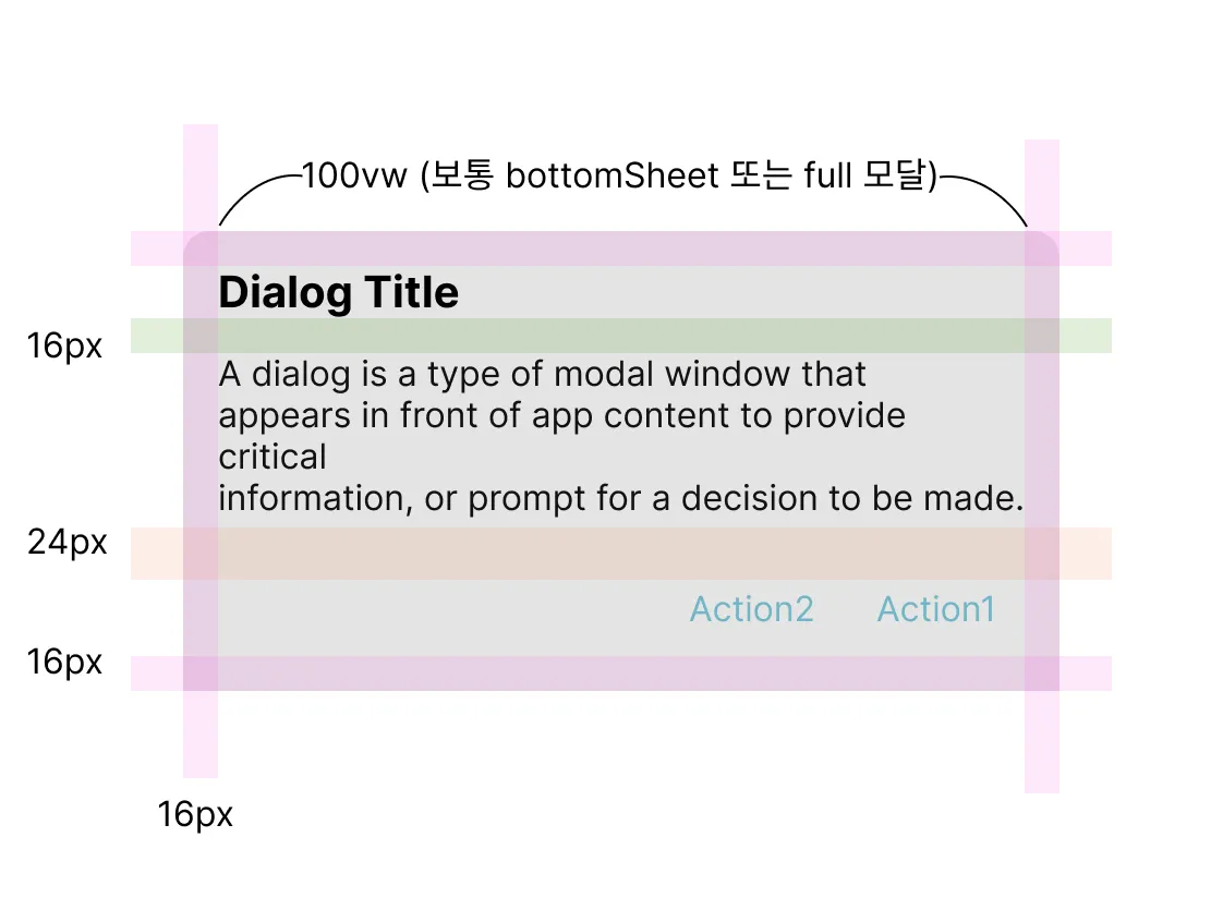
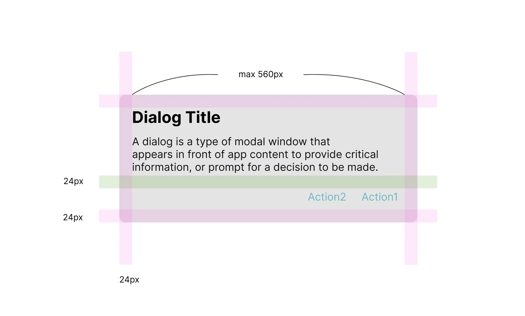
export default useScrollDisable;디자인 가이드라인
모바일
PC
📚 참고 자료
- Material Design – Dialogs
- Apple Human Interface Guidelines – Modal Views
- MDN – dialog element
- React Docs – Portal
- TanStack Headless UI – Dialog
- W3C ARIA Dialog Practices
- Smashing Magazine – Accessible Modals
- WCAG 2.1 – Contrast Requirements
- MDN – inert 속성
✅ 이 가이드는 실무 중심의 시각으로 모달을 해부하며 UI/UX와 접근성, 코드 구현까지 아우릅니다. 블로그 또는 팀 내 가이드로도 활용할 수 있습니다.